Decorating Choices That Make Designers Cringe + How to Fix Them
Take a look around your home. Is there something that stands out that just makes you cringe every time you see it? Maybe it’s a frame that’s hanging crooked. That should be easy to fix with a simple adjustment to the artwork. But what if it's actually your own (or your partner's) decorating choices that are bugging you? That's less simple. If you can't bear to look at the wallpaper you hung in the bathroom anymore, or you want to overhaul your spare bedroom, we want to help.
We spoke to some of the members of our Home Stylist Collective about the design and decorating choices that they’ve seen in their own homes or in their clients’ homes that make them cringe, and we asked them to provide a practical tip for how to improve the design. This is what they had to say:
Kate Dawson, @KateTheDecorWhore - Follow the 4 P's
Kate’s biggest pet peeve is when “pictures are hung too high or smack dab in the middle of a wall, without taking into account the furniture layout.” It’s important to consider the rest of the room before you hang your artwork. Artwork should be hung at eye level so you don’t have to strain yourself looking up at it.
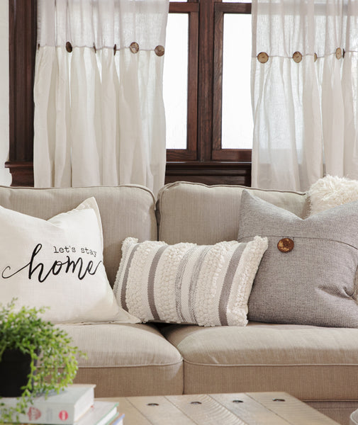
Kate also recommends that you never leave a sofa bare of decorative pillows. It’s part of her design rule she calls the “4 P’s” – which stands for Paint, Pillows, Plants and Pictures. As she says, “Pillows go everywhere.” They’re not just for the living room and bedrooms, they’re also for the benches in your dining area, the seating in your home office… you get the idea.
Lastly, Kate cringes at any window that does not have curtain panels. This is a great area to bring in a new pattern, new color or even a new texture. She recommends that you hang them high, as close to the ceiling as you can, and all the way down to make the space feel larger.

DeeDee Campbell, @TexasBlueBungalow - Don't Follow Trends
DeeDee thinks your designs should be personal rather than trendy. “I really don’t like to see people wanting to be like everyone else. You should be original, use what you have and create your own style.”
Her practical tip for anyone scrolling through Instagram or Pinterest is to use those images as inspiration, but don’t copy what you see exactly. Make sure your end result is what makes you happy. After all, you have to live in the space.

Joanne Rivera, @Glamour_Decor_By_Joy - Avoid the Clutter
Joanne takes more of a purposeful approach when it comes to design and finds herself cringing “when there is too much put out at the same time in a small space.” When you lack a true focal point in your design, you may be creating too much of a cluttered and disorganized look that comes off more messy than styled.

She recommends removing any excess decor that doesn’t belong. “Focus on a statement piece or two that you would like to stand out and then add simple smaller pieces that accentuate your statement pieces and create an elegant, clean and clutter free presentation.”

Remya Warrior, @RemyaWarriorDesigns - Kitchen Cabinets Go to the Ceiling
Remya is a kitchen design expert, so it's no surprise one of her biggest pet peeves is related to kitchen design. "I see this being done time and again when it comes to kitchen renovations. Instead of the cabinets going all the way to the ceiling, sometimes people leave one to six inches at the top to collect dust. You cannot even put something there to make that space useful."

The good news is, this is a simple fix. And it shouldn't come at great expense. Remya suggests, "If you have an 8-foot ceiling, use a 36-inch cabinets instead of 30-inch cabinets and add two moldings to reach the top." She adds that this is ideal because this way, even if your ceiling is not completely straight, the contractor can hide that using the two pieces of molding -- one flat piece at the bottom and the crown molding at the top.

Marissa Stiff, @MXLLuxeInteriors - Chop Pillows and Hang Curtains High
There are two things that make Marissa cringe. First, she is not a fan of flat accent pillows "that don’t have the infamous karate chop" like shown in the image below. This is a very simple fix, just fluff up your pillows and push your hand through the top like someone in karate would do to break a board. She recommends that her clients "use the feather down inserts for pillows to give their furniture a more luxurious look, even if the furniture is a bit outdated."

Second, Marissa is not a fan of seeing her clients' window treatments installed at the window seal. She informs her clients that installing the curtains above the window seal creates the feeling of taller ceilings and more open space.
More from the Home Stylist Collective
If you have any design questions or if you are looking for professional advice for any room makeover, please visit our Home Stylist Collective directory and contact one of our talented stylists and designers for a virtual or in-person consultation.


Well written blog. Keep up the good work. Your blog post was informative and precise.
Leave a comment