


Incorporating the Colors of the Year Into Your Home Decor
As we bring in the new year, many of the big paint companies are releasing their “colors of the year.” This year's theme is soothing earth tones that enhance relaxation and create a natural oasis. Moody rich hues and various blues are very much in style. There are so many fun ways to incorporate this year’s colors into your decor to stay on trend but still make it your own!
First, let’s discuss this year’s picks!
Bring on the Blues

C2 picked shade "Thermal," which is a mid-tone blue, reminiscent of the sky. This soft blue is the perfect calming shade, a great addition to any space that needs a soothing touch.

Similar to C2, Sherwin Williams chose a baby blue shade entitled, "Upward." This shade is perfect for creating a calming space. It has the energy of relaxing on a cloud and peering up at the sky. It is the perfect blend of carefree energy and tranquility.

Another blue shade was picked by Dunn-Edwards. "Skipping Stones" is a cooler blue tone more reminiscent of clear ocean water. This fresh shade is perfect for revitalizing a living room, guest bedroom, guest bathroom or entryway area because it’s both welcoming and refreshing.

Benjamin Moore, following suit, also chose a shade of blue entitled, "Blue Nova." This shade, darker and moodier than the others, has a purple undertone, creating a serene atmosphere for those who choose to utilize its relaxing qualities in their home.
Organic Hues

Moving away from the blues, Glidden’s pick was a neutral beige tone called "Limitless." This shade is a perfect neutral base for any design project. In terms of decor, this is a great option because it's so easy to match the rest of your furniture and textiles.

Embracing the classic earthy tones, Dutch Boy’s pick is a deep forest green entitled "Ironside." This dark green is great for someone looking to foster a natural moody atmosphere. This rich dark green is fantastic in a boho living room and also great for layering in a bedroom. A cozy comforter in this shade will be sure to bring on the soothing vibes.

Another green-blue shade was chosen by Valspar this year called Renew Blue. A soothing and peaceful shade, perfect for those looking to introduce a feeling of serenity into their home.

For those looking for a moody yet versatile shade to your space, Behr’s shade Cracked Pepper, may be the perfect pick for you. A soft black, Cracked Pepper elevates the sense and creates a warm yet moody vibe.
Just Peachy

Moving away from the moody neutrals and blues, HGTV Home's pick is a cheery peach shade entitled "Persimmon". If you’re looking to brighten up a room, or are trying to give your space a more positive vibe, this is a fantastic color choice.

Following suit, Pantone's color of the year is a gentle peach shade entitled "Peach Fuzz". This shade is a warm and modern shade that inspires a serenity and sense of peace. It is the perfect addition to any bedroom or living room that's looking to be welcoming, yet relaxing.
Styling with the Colors of the Year

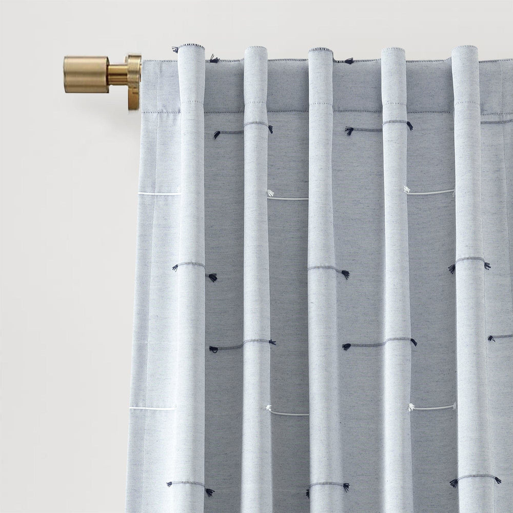
To welcome this year’s colors seamlessly into your decor, lean into natural and earthy tones and textures. Accentuating earth tones with materials that bring out their organic qualities will provide the easiest transition. Shades of blue are particularly popular this year. Blue fits seamlessly into coastal decor and design, but can also be a great base color for moody decor. Try utilizing blue accents in your bed layering or as decorative pillows in your living or bedroom.

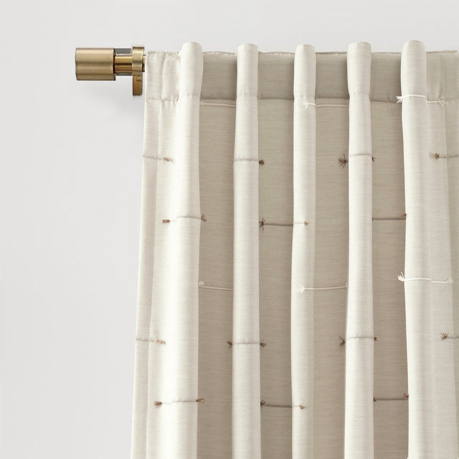
Similar to years past, neutral and earthy tones are popular. Neutral tones are a great addition to any space as they can be used to layer seamlessly, or can be the star of the show. To incorporate those neutral tones we see from this year, try a neutral quilt as the first layer of your bed, or neutral curtains to drape and dress your windows.

If you're looking to lean into the brighter colors of this year, try out a peachy pink shade in the bathroom. Using this color in the bathroom can give a sense of revitalization and clean comfort.
There are so many ways to incorporate this year's colors of the year into your decor. If you’re someone who looks to embrace the natural and earthy elements of life into your decor, this year's colors are perfectly suited for you. If you’re someone who’s just looking to add a little bit of serenity to your home decor, this year's picks will work great in your decor as well. Happy decorating!

I just love this shade of peach “Persimmon”.
I love the idea of using the colors of the year in small pops! The emerald green throw pillows sound perfect for adding a touch of drama to my living room, and I can’t wait to find some orange artwork to tie it all together. Thanks for the inspiration!
Leave a comment